Interactive CAD Workspace Redesign
- Sole UX Designer
- UX Researcher
- Prototype Testing
- Visual Design
Aurora's bread and butter is a 3D CAD interface for modeling roofs and solar designs. I led a complete redesign of its front-end interactive interface.
Objective
Redesign an advanced 3D interactive interface to address learning curve and usability
Aurora is a web platform for professional solar installers to create 3D models and simulations of solar systems, who then present and sell those systems to home- and commercial property owners. Aurora's bread and butter is its interactive interface for modeling roofs and solar designs that generates industry-leading simulations. However, no user was able to figure out exactly how to use it without substantial training, and even some basic heuristic evaluation showed a lot of unintuitive interactions. While the back-end and computation processes were mostly locked in here, I led a redesign of the front end interface from the ground up.
User Research
I observed 20 new users in the trial phase of the platform trying to create one of their first solar designs in the app. I also tried to understand their mental model for thinking about creation by first asking them to conceptually describe their goals.
Observations
The product was so problematic that there was no way to finish any usability test without significant intervention on my part as a moderator. I made a note of every part I had to explain, both large concepts and small interactions, as an area to improve. Some of the largest areas were below.
-
Lack of hierarchy and direction.
Users were dropped into an editor with no directive where to look next or what was required of them. The most common question was "Now what?" -
Hidden interactions.
Users were required to right click, double click, ctrl-Click, etc. for many required behaviors and there was no explanation for those. Many of those also went against convention. -
Information Architecture mismatch.
Users had to go back and forth across multiple pages to complete their core task (iterate on a solar design's performance) -
Mismatch of concepts.
Users were asked to modify 3D properties in 2D, requiring a kind of spatial conceptualization that many people didn't have -
Glitchy interactions.
Though bugs are a fact of life, there were so many that many interactions were highly irreversible or disruptive.
Design
Simplifying the workflow
The most important objective was to simplify the workflow and make it match users' conceptual goals and models.
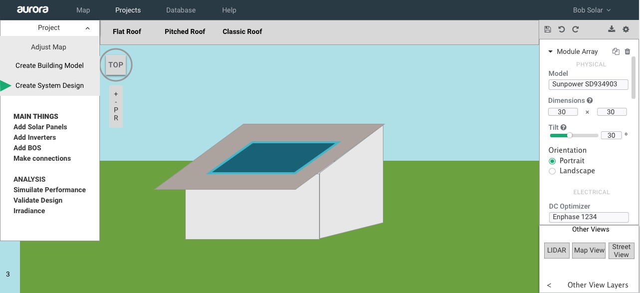
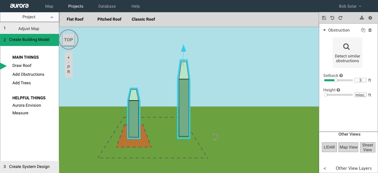
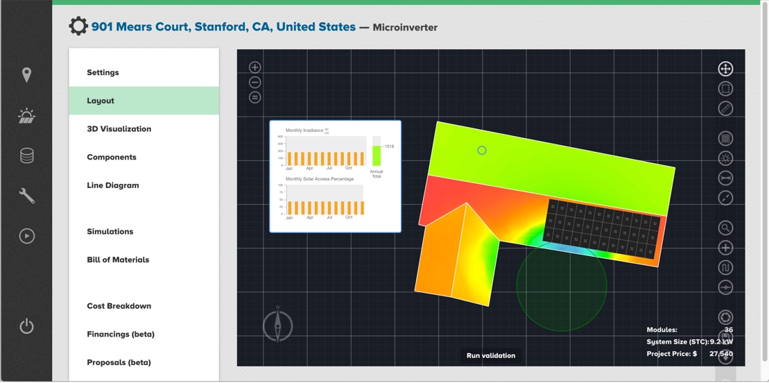
Organized Layout
Previously, every tool and setting was listed in a single row of icons on the right. I surveyed all of the functions available and grouped them, distributing them visually around the canvas by function, applying Gestalt principles of grouping.
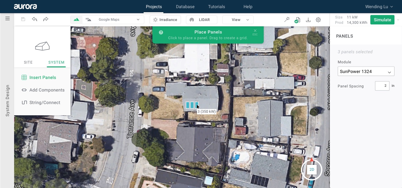
Intuitive and Discoverable Interactions
Since the total number of functions this CAD viewer enabled was quite manageable, I opted to use a single left-click interaction whenever possible. In addition to being more discoverable, this would also build extensibility into future tablet-compatibility.
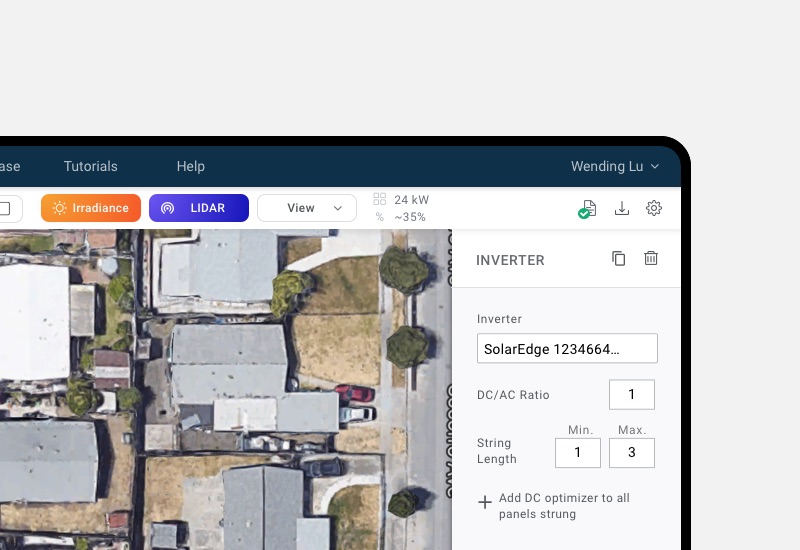
Docked Inspector
Previously, users had to right click on canvas elements to adjust their properties—an essential part of customizing their design. Many users weren't aware of that interaction or which properties would be in there, and the floating properties box that appeared often also got in the way visually. I solved this with a permanent location for property settings.
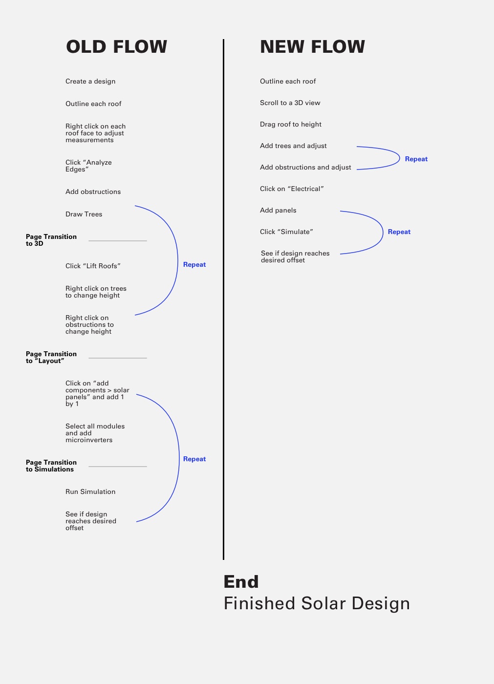
Revised Information Architecture
Previously, users had to visit 3 pages sequentially to complete a model. I saw that many people needed to move back and forth between those steps, and that the order did not match their mental working model. Crucially, people needed to simulate (the last step) and go back and iterate, a task that was extremely cumbersome if they had to leave the page. I worked with engineers to solve technical roadblocks to a solution that allowed users to seamlessly switch between 2D and 3D, and run the simulation anytime on the page.
Preventing Death by a Thousand Cuts
While the above were the most notable changes, there were many small interactions that created a frustrating experience in amalgam—for example, things that wouldn't highlight on selection, things that wouldn't snap when dragged, etc. I made it a priority to note and address hundreds of these sorts of expectations that emerged both in usability tests and in personal testing.
Prototyping and Testing
Wireframes were instead tested mostly for layout and organization to see if users could quickly identify functional and navigational areas. Since this was an interactive tool whose overall function and task was already market-validated but whose implementation was highly problematic, we focused more on testing with alpha and beta releases.
Final Design
The final design included going through every possible workflow and marking clear usability paths, error handling, and messaging in alignment with the primary direction tested.
Testing and Release
For the hi-fi prototype, I worked with engineers to dial in a private beta test that could be made available to a single enterprise client since the success of this particular product depended so much on the interaction design component. The beta test was so successful the client rolled it out to their entire salesforce within two weeks, instead of waiting for a final release.
We eventually released it to all users as a gradual roll-out, and there were a few months of discovering and iterating additional bugs and micro-flows afterwards. However, initially, only about 40% of users created a design were able to run a solar simulation in the first week. In a stable period after release, over 90% of new users were able to. Our NPS scores similarly improved during this time period, with far fewer detractors who cited the usability of this piece of the product.